Friday, July 22, 2011

HMS Indefatigable- The "Splash" project

I am revisiting a body of work that I started in 2009. This work is inspired by a photograph of the sinking of a English war ship HMS Indefatigable during the Battle of Jutland May 31,1916. 

The HMS Indefatigable sinking after being struck by shells from the German ship Von der Tann. Only three sailors out of 1,017 survived. Here is the link to the Wikipedia page. http://en.wikipedia.org/wiki/HMS_Indefatigable_%281909%29
It’s a dramatic image of the ship sinking shrouded in smoke and clouds on the horizon. This intense action is taking place so far away that it obscures the gravity of the struggle. In a closer examination of the photo I noted an area of white water in the foreground. It looks to me as if something has hit the water and created a splash, moments before the photo was taken. I began to imagine that some other unseen ship was firing at the ship that the photographer was on. The area of white water was evidence of a near miss. The shell harmlessly exploding in the water next to the ship sailing by. 

  My reinterpretation of the photograph started with some drawing with ink and white gouache. 

Ink and Gouache on white paper. Copyright Robert Gould 2009

Ink and Gouache on white paper. Copyright Robert Gould 2009

Ink and Gouache on white paper. Copyright Robert Gould 2009
 These drawing lead me to examining the relationship between the sky and water. First, tonally with ink, & then with color using oil sticks on paper. I like the composition, however ultimately color is going to be an important element of this work. The sea and sky merging together has be just right. 
Unfortunately the photos of the paintings below are washed out. I am going to have to re-shoot them at some point. 
Oil stick on brown paper shopping bag.

Oil stick on brown paper shopping bag.

Oil stick on brown paper shopping bag.

Oil stick on brown paper shopping bag.
Adding the tricky element of color reminded me of the painting “Nebraska” by Brice Marden.
“Nebraska” by Brice Marden 1966.
The color must be perfectly balanced as in the Marden work. It would be nice to observe the true color in nature before I can continue with the project.

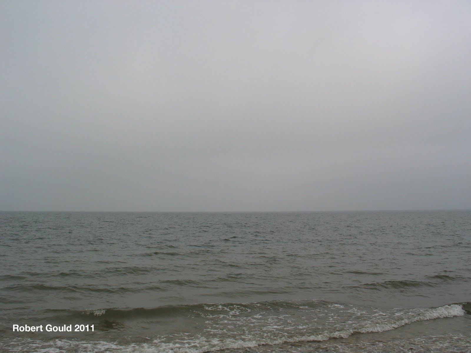
This summer our vacation cottage over looked the Long Island sound. Seeing the ocean view reminded me of my splash project and the location enabled me to observer the sea and sky for an extended period. I had the luxury of just grabbing the camera a taking a few pictures every time the light conditions were right. The result was a collection of photos and a starting point for some more oil color studies.


No comments:

Post a Comment